
Year
2021
Duration
30 days
Type pf Work
Visual Identity, Branding, Character Design, Motion Design, Illustration
Client
Marcos – Los Pollos Brasileiros
Team
Thalia Moniza: Graphic Design, Illustration, Character Design
Bianca Tavares: Graphic Design, Illustration, Motion Design
Desafio
The Los Pollos Brasileiros is a restaurant and snack bar located in Campos dos Goytacazes, in the interior of Rio de Janeiro. They offer a rich variety of options on the menu, with their specialty being fried chicken. Inspired by a fictitious brand of Chilean and American origins, the client wanted to bring the same concept, but this time paying homage to Brazil and showcasing the Brazilian way of life: festive and filled with contagious fun.
With the aim of becoming a new franchise in the market, the brand needed a repositioning to appeal to a younger audience, while still retaining its family-friendly appeal.
Given the breadth of the project, we thought about many details, and every touchpoint was considered: application on graphic pieces for social media, menus, uniforms, cups, packaging, banners, etc.


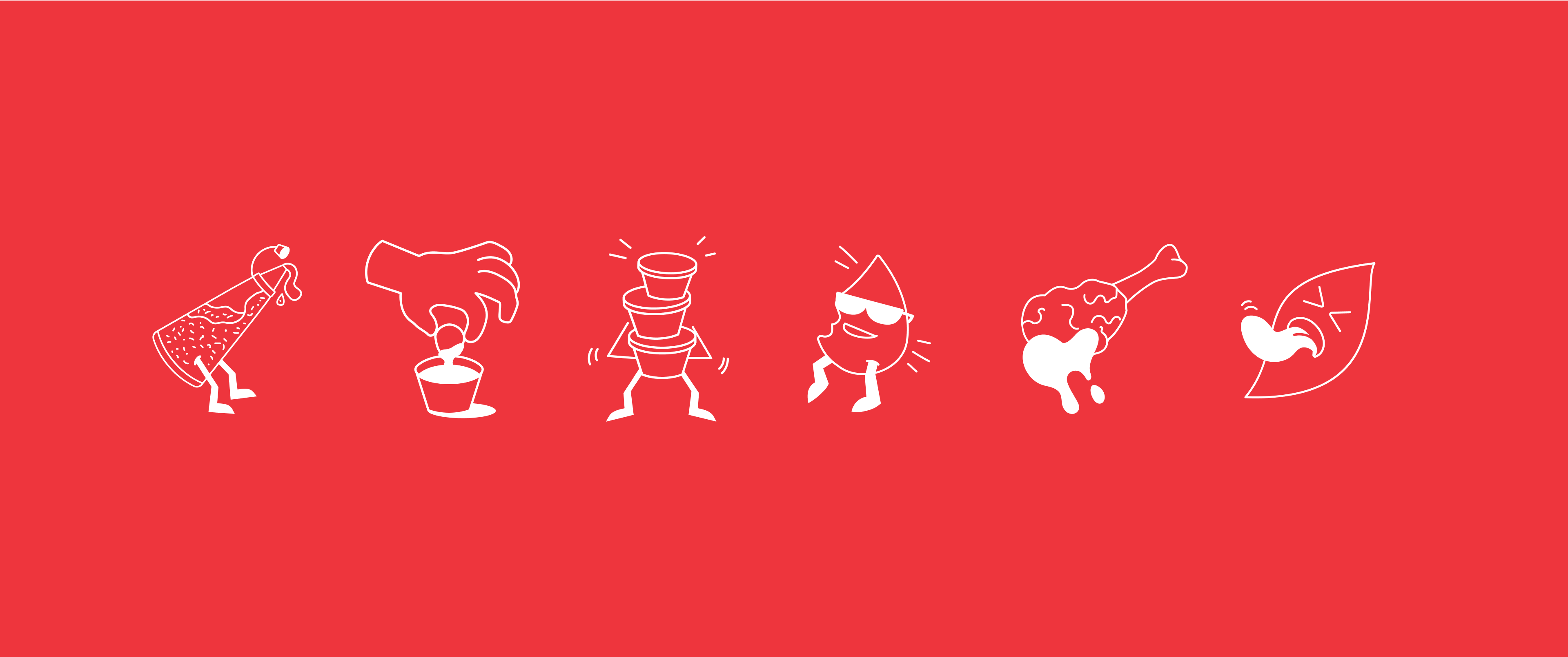
Creating Brand Mascots
In addition to managing the entire strategy and the new visual and verbal identity, we also developed new mascots for the brand. “Two chicken friends from two different places who exchange cultural experiences and share the same passion for celebration. Inspired by the characters from Los Pollos Hermanos and The Three Caballeros, with a modern twist and unique personalities.”
We created supporting characters that embody the idea of partying + Brazilian and regional culture. We brought to life distinctive elements such as side dishes like bolinho, kibe, coxinha, special sauce pots, the famous homemade mayonnaise, and, of course, the fried chicken.


Final Conclusions
Consequently, the repositioning project for Los Pollos Brasileiros aimed to establish it as a new franchise in the market, targeting a younger audience while maintaining its family-friendly and inviting essence. The visual and verbal identity were completely reimagined, considering all touchpoints, from social media graphics to menus, uniforms, packaging, and banners.
Additionally, new mascots were created to represent the interaction between two chickens from different origins, sharing the passion for celebration and enriching Brazilian culture. The end result was a vibrant brand that celebrates Brazilian joy and fun, with fried chicken remaining as the flagship product of the company.

3 Responses
I truly love your site.. Pleasant colors & theme.
Did you create this web site yourself? Please reply back as I’m looking to create my
very own website and would like to find out where you got this
from or what the theme is called. Kudos.
Hey, thanks! It’s not a theme, I’m a designer and I designed this website!